Patano + Hafermann Architects
Art Direction, Identity Design
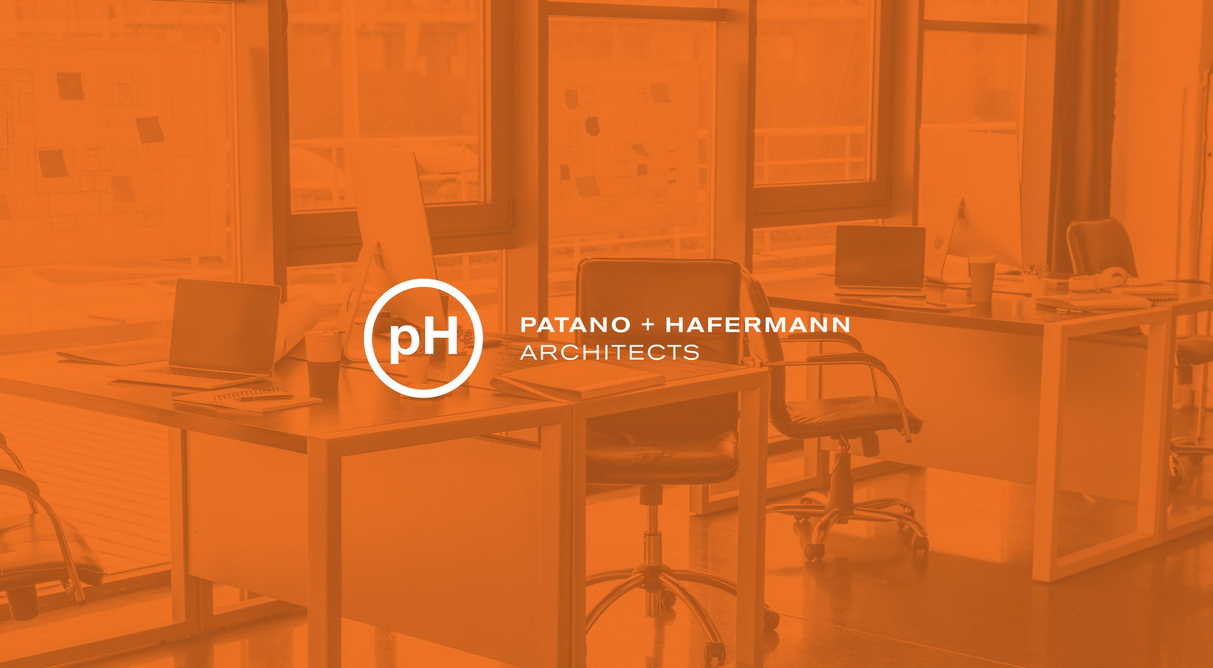
Patano + Haferman Architects sought an update to their visual branding informed by their philosophy of well-crafted simplicity. The solid but elegant logo is easily scalable and serves as a versatile mark in the various materials in which it appears. The bold orange adds a dynamic pop against the natural materials often used in the firm’s work.


